
Desktop • Visual Design • Information Architecture • Branding
Story Dogs Website Redesign
Role
Product Designer
Timeline
5 weeks
Target users
Members of the public engaging with the charity
Volunteers in the organisation
Educators engaging with Story Dogs
Outcomes
Greater user recall of the redesign home page
More positive descriptors used when recalling the site
Summary
Story Dogs is an Australian non-for-profit which provides research-backed reading programs to support children who are behind in literacy.
I love the work of this charity, and share their passion for education. The charity operates Australia-wide, and as a result, requires a strong digital presence, as it would be the first point of contact for many people.
The original website had a number of usability issues that would negatively impact a user’s experience and ease of donation. Additionally, the brand look and feel was inconsistent on the site, and felt out of date.
Objectives
Apply the Story Dogs rebrand I’d created
Improve navigation and information architecture of website
Redesign donation page and donation flow to improve UX
Redesign the home page with new site structure, applying new brand

Redesigned home page

Redesigned home page — full

Redesigned home page — improvements

Redesigned donation page
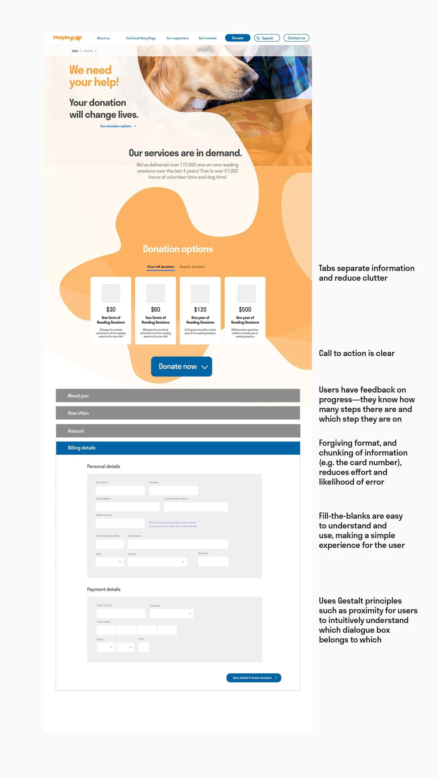
Redesigned donation page — full

Donation flow
Discovery
Providing a consistent and clean interface with a logical underlying structure and flow between pages is an essential part of building trust with users. Building a positive relationship with users is important for all organisations, but this is especially the case for non-for-profits, which rely on donations from the community.
Initial audit — marking up potential usability problems
An initial view of the original website showed a number of critical usability issues.
I saw three main problems with the website:
1. It was visually ‘busy’ — this included many elements, elements close together and lots of text
2. It was confusing — it was unclear which elements were clickable buttons vs. decorative graphic elements, and the page labels didn’t make sense
3. It was inconsistent — many different fonts, type sizes were inconsistent and had conflicting hierarchy, and visual elements (e.g. shape, colour, pattern) didn’t seem to relate to each other.
Additional usability issues included confusing navigation and lengthy pages.
Defining project scope
Based on this initial exploration of the usability issues, I focused on:
redesigning the home page
improving the IA and navigation structure
redesigning the donation page and improving the flow to make a donation.
Confirming usability issue hypotheses through user testing
I ran initial user tests (5-second, first-click, and usability tests) to confirm my hypotheses about the usability issues on the site. These would be critical areas to target.
Contextual exploration & mapping
I started conducting contextual exploration and mindmapping to better understand the context where users would be engaging with the charity and using the site. I needed to understand different layers of the user’s experience in order to effectively redesign the website, including restructuring navigation, the home page and donation flows.

The original website

Usability issues within the navigation

Initial user testing to support hypotheses on usability problems: ran usability tests, 5-second and first-click tests
Mapping site tree

Iterating first nav design

First test on the updated nav design

Insights from Semrush content audit

Iterating second nav design

Second test on updated nav design

Sketching donation flows

Clarifying problems in donation sequence
Design & Iterations

Mapping site tree
Iterating first nav design
First test on the updated nav design
Insights from Semrush content audit
Iterating second nav design
Second test on updated nav design
Sketching donation flows
Clarifying problems in donation sequence

UI design process
Simplifying structure of website
I mapped out the original site tree of Story Dogs, then started simplifying the navigation. During these iterations, I conducted several tree tests to check the logic of my updated navigation design. After each test, I used the insights to improve the design.
Conducting web audit — Semrush, & content strategy
Following this, I explored other ways I could better understand the structure of different pages within the website. This led me into learning more about content strategy and IA processes. I used Semrush to give me more insights on the number of pages in the website, and which pages would be useful compared to which pages could be cut or condensed.
Home page & Donation flow redesign
Sketching wireframes
I started sketching out wireframes for the home page and donation screens. I developed wireframes for a user flow of someone donating to the charity. There were one or two areas within this flow that were more challenging, and didn’t quite work. I reviewed a couple of flows from existing products to better understand the sequence within this products, and used those insights to improve on my donation sequence.
Low-fidelity —> High fidelity prototypes
Following these sketches, I created different iterations of low-fidelity wireframes, then built the best wireframe into a high-fidelity design.
Testing

Running first-click tests

Running 5-second tests
Comparative testing to understand impact
A/B tests — 5 second tests — First-click tests
I conducted A/B testing, 5-second tests and first-click tests comparing the old design to the re-designed pages in order to understand the impact of the redesign.
Insights
These tests showed that users had greater recall of the redesigned page and used more positive descriptive words when remembering the website. Additionally, 60% of users felt ‘extremely confident’ they knew where to donate on the site, compared to the original design where users had an average confidence level of ‘very low’.
Usability testing
Next steps would be to run usability testing on the high-fidelity prototypes to better understand how the redesigned user flow impacts the user’s experience and ability to achieve their goals on the new site. Insights gained from usability testing data would also show areas I’d need to iterate on to improve the functionality and overall experience on the site.