
Product Design ✳︎ Mobile
Nice Choice! Mobile Sustainability App
Summary
The Nice Choice! app is a mobile sustainability guide for university students aged 18–30. It reduces the time and effort required to make informed, sustainable consumer choices, by centralising sustainability information on products and reducing the confusion around what daily consumer choices cause the least environmental harm.
Role
Product Designer
Timeline
12 weeks
Client
Monash University project
Project phases
→
→
→
→
✢
Problem
Sustainability is a critical global issue
Human impact on the world needs to be examined and altered so the environment is liveable for future people, flora and fauna.

Consumers can’t easily understand the ecological impact of their habits
sustainability information on consumer goods is decentralised
product labelling relating to sustainability is unclear or absent

It takes people time and effort to understand their consumer impact
For example: comparing and remembering sustainable brands is a high cognitive load
Due to time and energy barriers, consumers are unlikely to:
research the environmental impact of goods they’re buying
maintain habits of choosing the most sustainable goods
→
Impact
greater environmental harm
lower engagement and sales for sustainable brands
Initial thoughts: what is within individuals’ scope of control?
Sustainability practices of global corporations can have massive impact on our environment.
But, for the individual person as a consumer, what is within their scope of control?
What areas of their behaviour and habits can be targeted with an app?
How can they improve their awareness and practice of different sustainability habits?
What everyday sustainability habits can people enact, that will reduce their sustainability impact?

How might we reduce time and energy barriers involved in:
understanding what consumer choices are sustainable?
maintaining these habits?
Discovery & Research
First, I needed to understand:
my assumptions and ideas relating to sustainable behaviours
the area of sustainability, broadly, for greater insight and understanding of problems within this area
what areas there are within the domain of sustainability to focus on and define scope
students’ attitudes towards sustainability, their consumption habits and sustainability habits
To achieve these initial goals, I…
Conducted secondary research about sustainability
Mind-mapped the topic of sustainability
Documented my assumptions on sustainability and students’ attitudes and behaviours towards sustainability
Focused on 3 key domains relating to sustainability; ethical shopping, fashion choices, and reducing waste
Analysed task domains of these 3 domains, mapping out how people may complete these tasks differently
Generated and refined interview questions, to interview a group of students about environmental awareness and consumption habits
Discovery snapshots

Mind-mapping ideas around sustainability

5 W's & H to explore the domain of 'fast fashion'
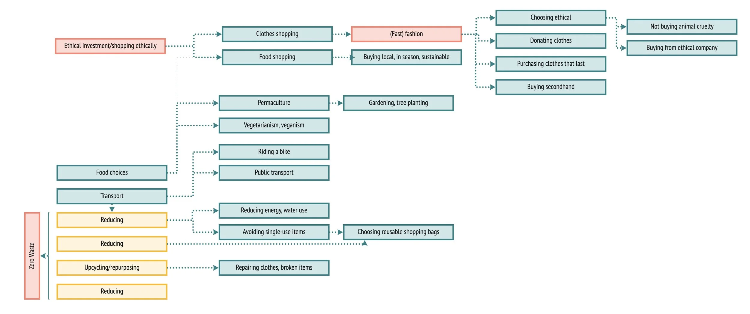
Focusing on 3 key domains within sustainable everyday behaviours

Example of a task domain analysis: different ways to get new clothing

Collated, ranked and refined questions for user interviews, relating to chosen task domains
I conducted user interviews, then collated and analysed data
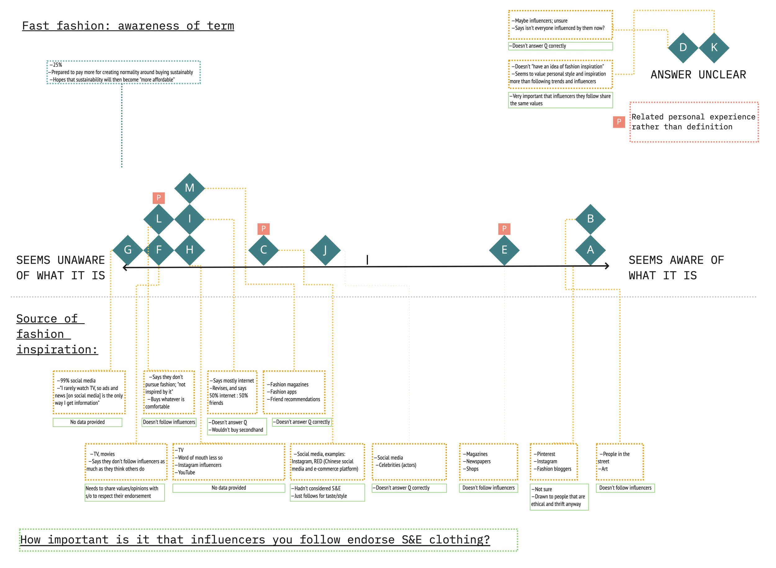
I ran user interviews with 13 students, aged from 18 to 30 and showing a range of environmental attitudes and sustainability knowledge
I recorded and collected transcripts, collating data into a large spreadsheet
I then used qualitative data analysis to track and quantify key themes raised by different participants
I analysed data and compared participants’ answers to each other, and found patterns using methods such as affinity mapping
Having analysed this data, I could then validate and disprove my assumptions
Interview data analysis

Collating answers in spreadsheet to then qualitatively identify recurring themes

Quantitatively identifying themes, analysis in progress
Using affinity mapping to visualise similarities and differences between participants' answers

Summarising similarities and differences between participants in a table
Interview findings
Personas
In analysing the data, I could see two distinct, contrasting types of students.
Creating a persona sheet provided tangible, data-backed ‘snapshots’ to refer to in later design phases.

-
Wants to choose sustainable & ethical options (S&E), but doesn’t always research before purchasing, as this takes time and effort
Medium to high awareness of sustainability concepts, e.g. 5 R’s
Driven by ethics and desire to help people, animals and the environment
Sense of individual responsibility to 'do her bit’ for the environment
Limited by low income and time
Currently has waste reduction habits, such as bringing cloth bags when going shopping
Upset by wasteful people and practices such as excessive packaging

-
Michael doesn’t prioritise sustainable & ethical options; low price is always first
Low/superficial awareness of sustainability concepts, e.g. doesn’t understand what fast fashion is
Driven by novelty and trends
Doesn’t feel that it’s his responsibility to choose sustainable and ethically
Currently no waste reduction habits, and prioritises convenience — e.g. doesn’t mind single use items
Upset by low quality items that break, and dealing with waste
Unexpected findings
These challenged my assumptions and I didn’t really expect them
Half of the group do no research before a purchase, half research “some” to “a lot” before a purchase — this is more than I assumed would do research.
A question I have now is ‘Why’ — what is motivating people to do this research? Based on student desire to pay more for well-made items, one assumption could be that people wanted to find an item that won’t break quickly. This would require further enquiry.Students don’t feel justified to pay extra if the item is expendable, e.g. food
Students who cared more about the environment found research too much effort
The majority expected environmental information to be on labelling
Expected findings
These validated my assumptions and didn’t really surprise me
Price is the number one factor in a purchase, followed by quality
Students feel justified to pay extra for well-made items that last
Most people are motivated by personal satisfaction of doing good
Scope definition, and opportunities to help Kat
I chose to focus on ‘Kat’ personas of students. Kat already shows environmental interest, and some willingness to make habit changes.
It would be an interesting idea to explore how we might motivate a person like Michael, who is not motivated by the environment, and has low initial willingness to make environmental choices and change his habits. However, this would be best explored in another project. To limit scope in this project, I’ve decided to focus on students that show some environmental motivation in their habits.
Research insights showed that there are opportunities to help Kat make more environmentally sustainable choices. In particular, she is limited with time and energy, and doesn’t always do research before she purchases items.
Ideation
Brainstorming
I ran a number of activities to help me better understand problems faced by Kat. I also started to sketch and develop ideas for app features.
Problems & Anti-problems
I brainstormed ways to make Kat’s problems worse and asked ‘Why is this a problem’? This helped me better understand the layers and root cause of these problems, and it also tested my understanding of these issues for her.
User stories
I created user stories for ideas to reframe the ‘How Might We’s.
How Might We…
I framed problem statements as a challenge to come up with ideas for possible solutions.
Consolidated problem statements + HMW + user stories + ideas
I consolidated the problem statements with ‘How Might We’ questions, user stories and ideas.
Concept development
I began sketching features for ideas that came up while learning new insights from research.
Forced rankings
I conducted forced ranking for early feature ideas where I measured feature ideas against criteria that’s important or beneficial to the user, e.g. time efficiency, or how effectively it could change user’s behaviour. Ranking showed which features would be most useful.
User scenarios
These allowed me to explore an ‘ideal future’, where the product or potential feature addresses a problem that the user has, and improves their experience.
Concept definitions
I defined the purpose and high-level functionality of the app. I also defined concepts related to the app and its features, to fully understand how different parts of the app would relate to each other, and to work out potential issues with this concept.
Storyboarding and Experience Mapping

Storyboarding provided images to clearly visualise and empathise with the problem, and to see how features would change Kat’s experience in context.

Experience mapping helped visualise the change in experience through intervention by the app and features within it.
Wireframes
I began sketching ideas for features as wireframes and flows, and iterated on these designs.

Crazy 8s
These allowed me to quickly come up with more ideas for features.

Participatory Paper Prototype
I ran a Participatory Paper Prototype workshop with a user to show different ideas that I’d missed, and divergent options.

Running open and closed card sorts
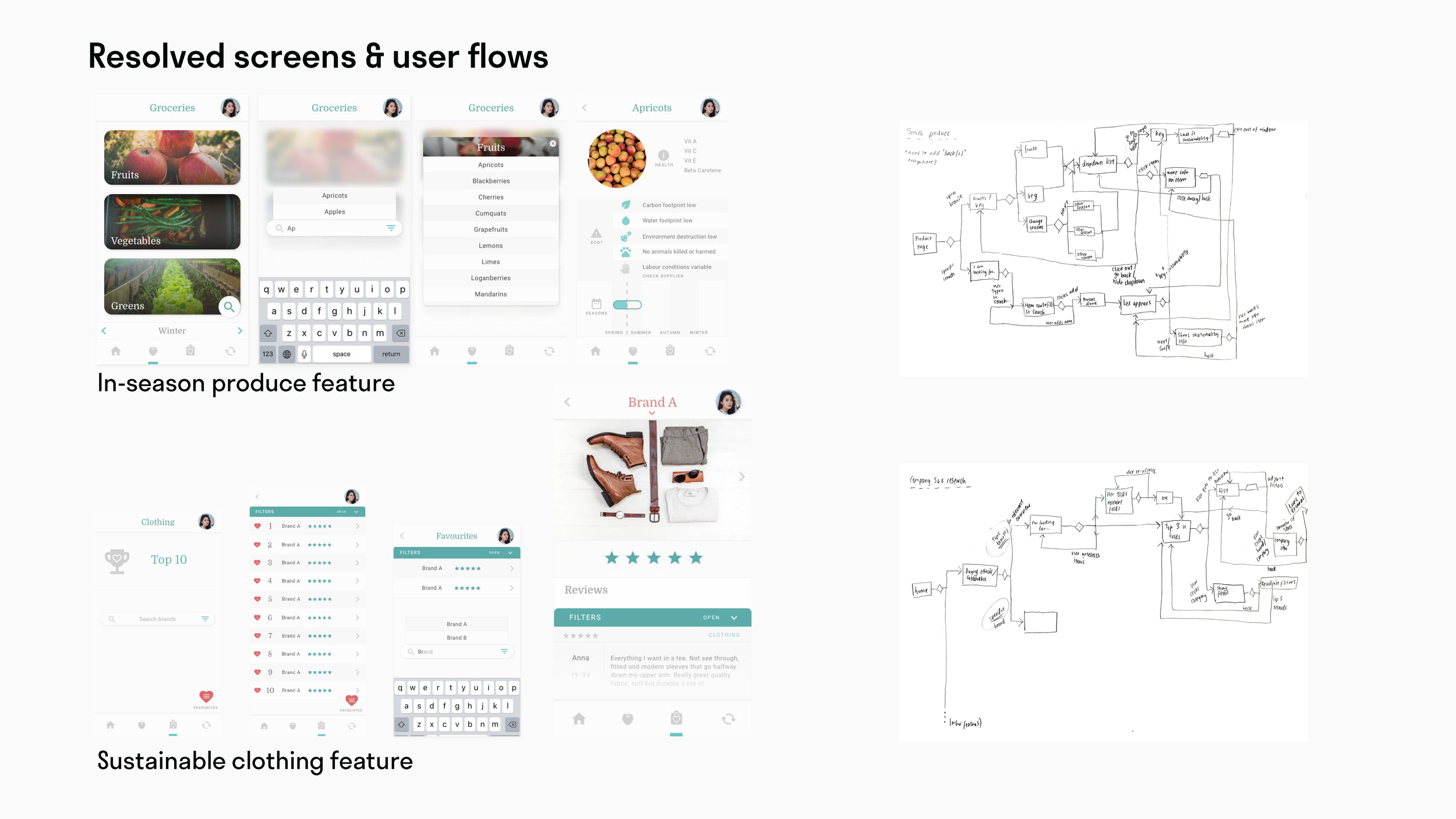
To improve the second feature (finding in-season produce), I ran open and closed card sorts with a group of users in the target demographic.
I recorded the session and documented insights, then improved the logic of how produce would be categorised in this feature.

User flows
I diagrammed features as user flows, using Jesse Garret’s visual vocabulary.
Deciding on features: opportunities to help Kat with everyday sustainability
We could help reduce the time and effort involved in researching the sustainability and ethics of brands and products she might buy from.
Feature 1: Provide brand sustainability information with rating and rankings
As Kat is also limited by budget, and doesn’t feel justified in paying a lot extra for expendable items (e.g. food), we could educate and encourage her to buy seasonal produce, which is cheap and has a lower environmental footprint.
Feature 2: Provide information on local, in-season produce
We could also reduce the time and effort barrier in helping her understand product end-of life, so she can make a less environmentally impactful choice when disposing of items.
Feature 3: Provide information on item disposal and reusable materials in it

Tree tests on Optimal Workshop
Running tree tests helped me understand whether the labelling and structure I’d designed made sense to users. I analysed the data, and made iterations to improve the structural logic of the app.
Design
Low-fidelity prototypes
Results from a cognitive walk-through helped improve the low-fidelity wireframe designs.
Paper prototypes testing the app features highlighted usability problems and issues with the design that I hadn’t considered. I changed the designs based on these insights before getting into the UI and creating digital prototypes.
Visual design
Moodboards → style tiles
I created 2 distinct moodboards, and reduced these down into 2x separate style tiles.
Results from a preference test showed that users preferred the first style, with fewer colours and a more minimal and sophisticated style.


First-click & 5s tests
These tests showed the clarity of the hierarchy and memorability of the designs, providing insights as to where and how the designs could be improved.

Design iterations after understanding the data
High-fidelity prototypes
I then developed high-fidelity prototypes with interactions and prepared to run usability tests.
Testing
I’d consistently tested different sketches and ideas throughout the project, and it reached the stage where a high-fidelity prototype could be tested.

Insights from usability testing
I found both design problems, and interaction problems that I needed to fix. Design problems included situations where the graphics and layouts were confusing for the user. Interaction problems involved cases where the interaction was confusing for the user, or didn’t happen as they’d expected.
I’d iterate on these and run further usability testing to see how the design changes had impacted the experience for users.
Implementation
In this project, I didn’t collaborate with a developer to create the mobile application. However, this is how I’d approach implementation in a different project.
Development collaboration
I’d work closely with developers to ensure the design was implemented accurately and to resolve any questions or issues with the designs. I’d leave documentation explaining relevant design changes to provide clear rationale behind the changes.
For the sustainable brands feature, third-party content such as sustainability certifications would need to be integrated.
I’d work with developers to resolve any challenges that come up during the process.
Design handoff
I’d document and label designs and assets clearly with detailed specifications for developers within Figma, or Zeplin.
If there are larger design changes, Loom could provide developers with additional context and visuals to ensure that the rationale makes sense, and they are across the updates.
I would conduct regular check-ins with the team to ensure alignment with the designs and to resolve any issues that crop up.

Reflection
About the design process
This project provided opportunities for hands-on skill development for mobile applications, from concept to prototyping. It allowed me to practice and run a number of design exercises that helped me understand different layers of the user’s experience, and allowed me to thoughtfully improve the app designs, based on user insights.
In an industry context, with greater project and time limitations, I would pick and choose the most valuable design exercises to run, in order to maximise gains based on available time.
In this context, the project would also have dependencies and would be more of a cyclical process rather than linear.
How I’d change the design next
Iterations and further testing
Results from prototype testing showed areas that didn’t work as planned, and were slightly confusing for users. In the next iteration, I’d take in these changes and run further testing to see how those changes impacted the design.
Accessibility
While the icons on the lower nav bar look subtle and suit the UI style, I now know more about accessibility and colour contrast. The contrast of the icons and some other parts of the UI would not pass A+ ratings.
In the next iteration, I would darken the grey used in the icons, or replace it with a dark teal so that it reaches at least 4.5:1. This would make the app more visually accessible for users that may have vision challenges.
Future changes to the project
Questioning ‘End of life’ feature
While correct waste disposal is an important aspect of lowering one’s environmental footprint, I am now wondering whether an alternative feature could have been more useful, both for the user and in terms of impact. Results from concept testing ranked this feature neither most or least useful, but further testing with other users would be of benefit, to see if there would be alternative features that could provide more benefit.
One of Kat’s pain points stand out:struggles with impulse shopping.
I’m curious about this point, and feel that targeting this issue in a different feature might be more helpful to app users. I’d explore the use of this option in future through further research with users.
Documentation
What went well
I documented sketches and assets clearly as I went, and organised them in folders with clear labelling. This made finding sketches and designs later a lot easier. This was helpful when reviewing my process and developing a case study.
Areas for future improvement
However, I didn’t document my thought process and design rationale as consistently throughout the project. Understanding my decisions later, as I looked back through the project, was harder and took more time.
For future projects, I’ll document projects as I go and include brief notes on my rationale for these decisions.
Process documentation could be done in FigJam or as brief notes in the design file. Summarising these into case study notes as I go would also be more efficient in future.